
Familiprix
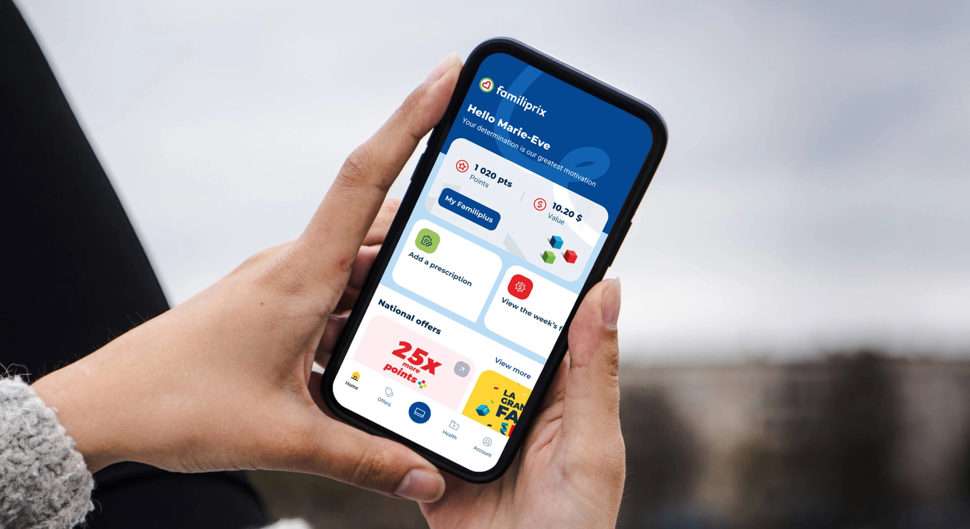
- Mobile Application
- Web
- Tablet Application
- Health
Context
Familiprix believes pharmacists must play an essential role in the daily lives of patients, helping them improve their quality of life. Therefore, Familiprix’s digital ecosystem must reflect the human character of Familiprix and help ensure that pharmacists are accessible at the right time, for the health of all.
Historically, Familiprix offered two separate mobile applications: one for its loyalty program and the other for the health space. Taking into account feedback from these applications’ customers and users, unifying the two apps became a necessity, while finding a way to retain the favourite functionalities of each and continuing to ensure the confidentiality of customer health data.
Objectives
A visit to the pharmacy is rich in human interaction, which we are not seeking to imitate, but rather to complement with a digital approach that meets three main objectives:
- ADOPTION - Make it easier for users to adopt the application
- ENGAGEMENT - Encourage regular use of the application
- RETENTION - Build long-term user loyalty by fostering new habits
Solution
A unified experience enabled by a biometric barrier
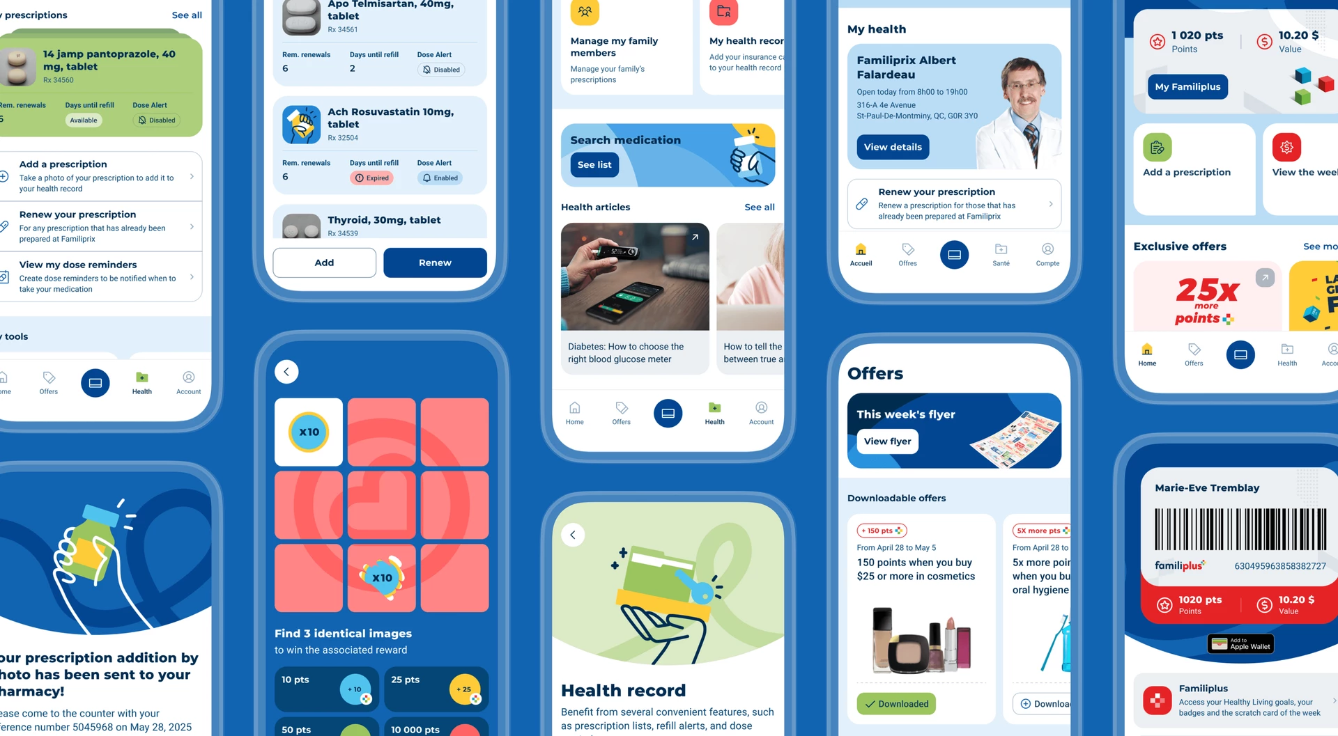
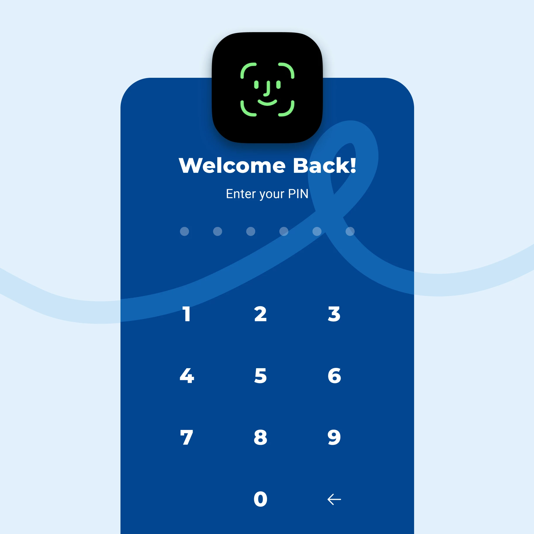
Familiprix's new mobile application had to ensure a clear and secure separation between the health and promotional loyalty sections, in order to guarantee the confidentiality of user data and comply with the pharmaceutical industry's legal requirements. Thanks to the integration of a biometric barrier, users can navigate fluidly and securely between the commercial and health sections.
The application's commercial environment (flyers, promotions, etc.) lets users take full advantage of the Familiplus rewards program.
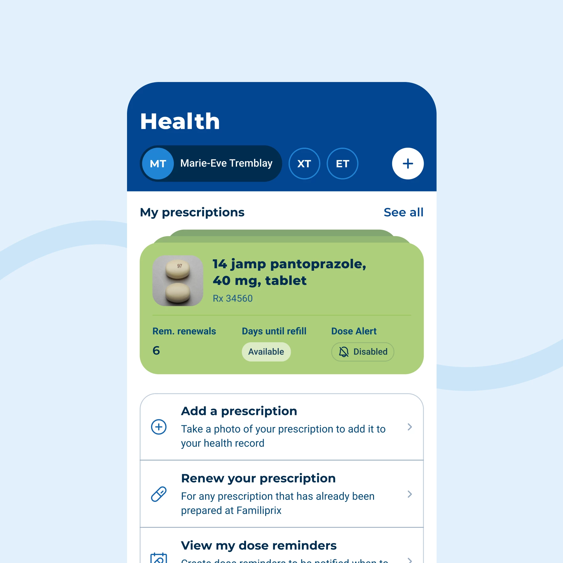
The health environment contains functionalities enabling users to easily manage their prescriptions and access practical information.
Design system
Customer-first design
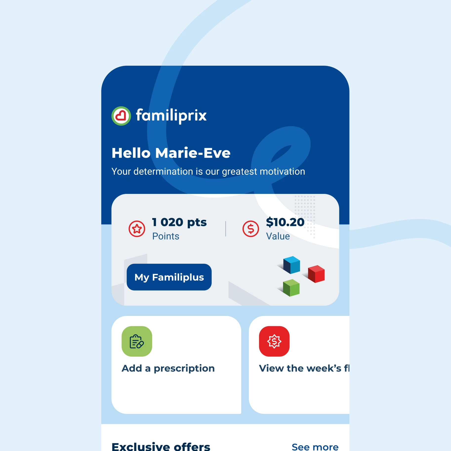
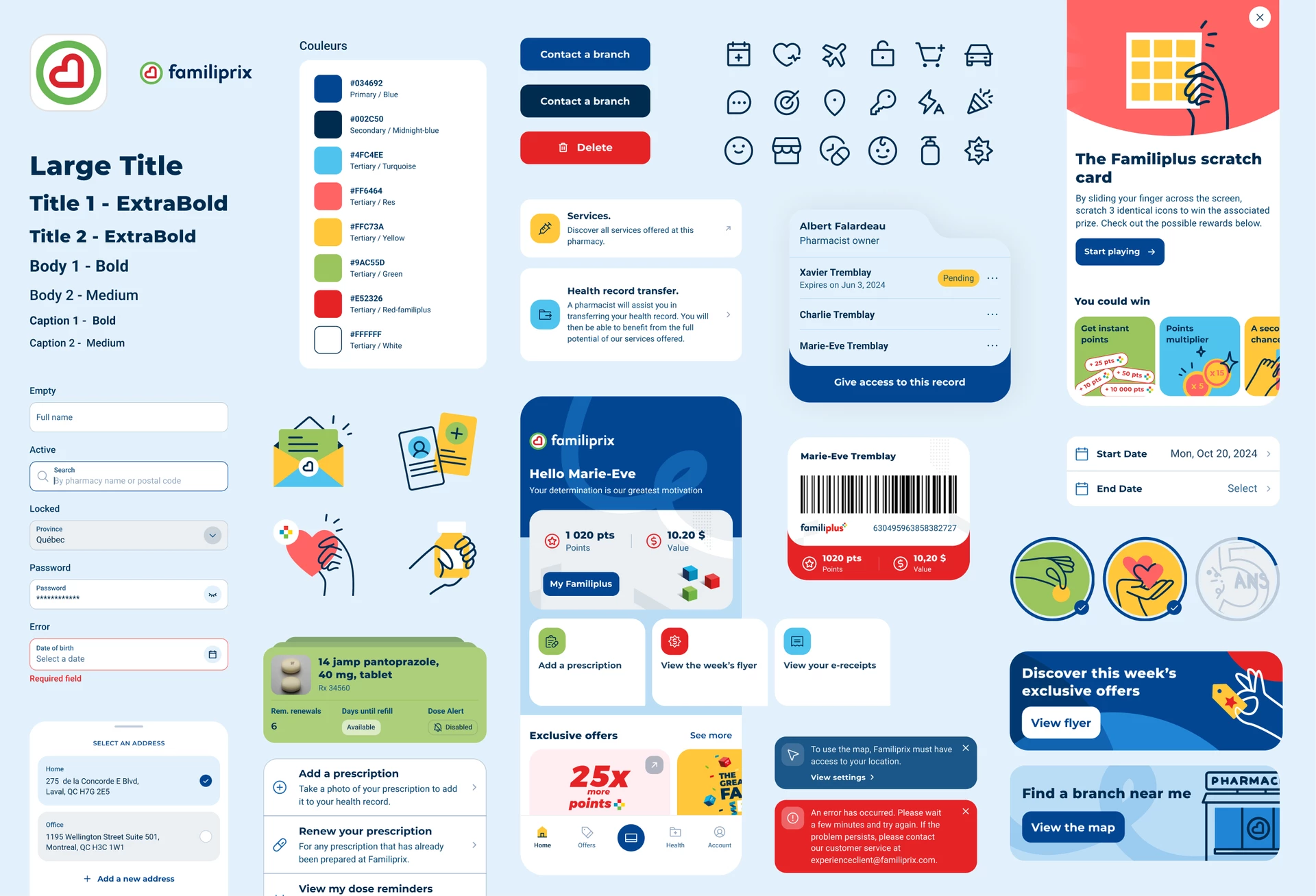
An audit of the brand's previous digital ecosystem was first conducted according to Nielsen's heuristic principles of usability, with the goal of improving the user interface. The new design system resulting from this in-depth analysis creates a remarkable user experience that is as aesthetically pleasing as it is functional.
The colours used in the application were reworked to create visual balance. The saturation of certain accent colours was also increased for maximum impact, and contrasts were optimized to improve accessibility.
Curves were explored in the design of components and blocks, echoing the logo and adding roundness to balance the boxes and lighten the design. New iconography and unique 100% custom illustrations were also created for the application.
Numerous animations were integrated into the interface to create a more vibrant, dynamic digital ecosystem that enhances the user experience by guiding and highlighting specific actions and clicks.
Key functionalities
Loyalty through engagement
Our research has shown that users value the proximity of their pharmacist. Customers appreciate being greeted and recognized when they visit their local pharmacy, so the digital experience should deliver the same sentiment.
Optimized Familiplus Experience
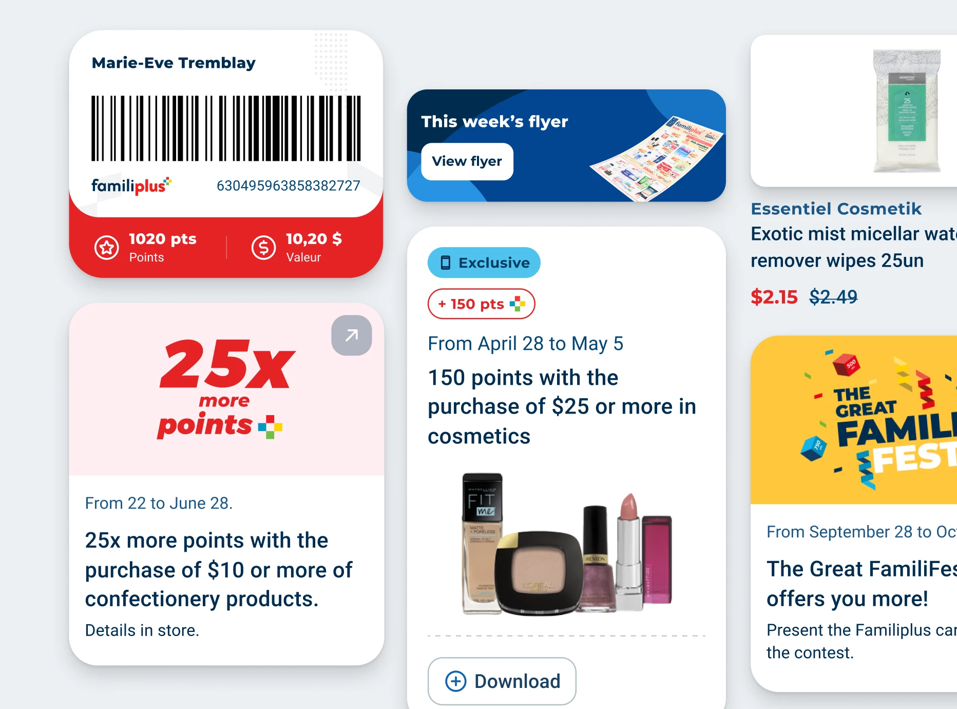
To provide a personalized experience for Familiplus loyalty program members, several features of the application are designed to maximize rewards. Members can view the flyer, discover current promotions and download their personalized weekly offers. Displaying purchase history and reward balance is also a breeze.
Recommendations in the User Experience
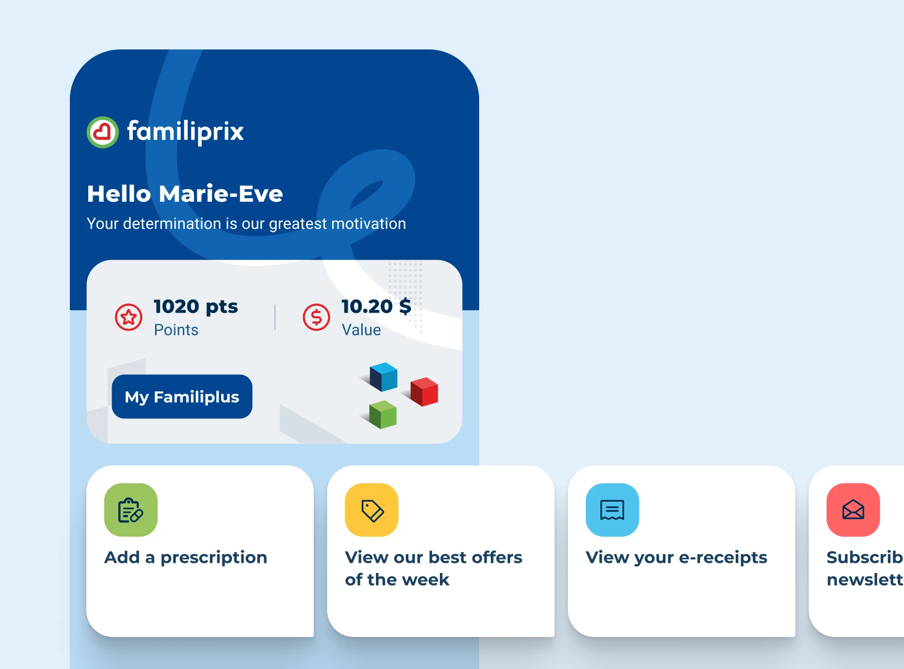
The dynamic, contextual home page evolves based on current promotions and offers and the user's profile. By highlighting the next recommended action, users instantly know the next step to take to maximize their engagement in the Familiplus Rewards Program and use of the application.
Healthy Living
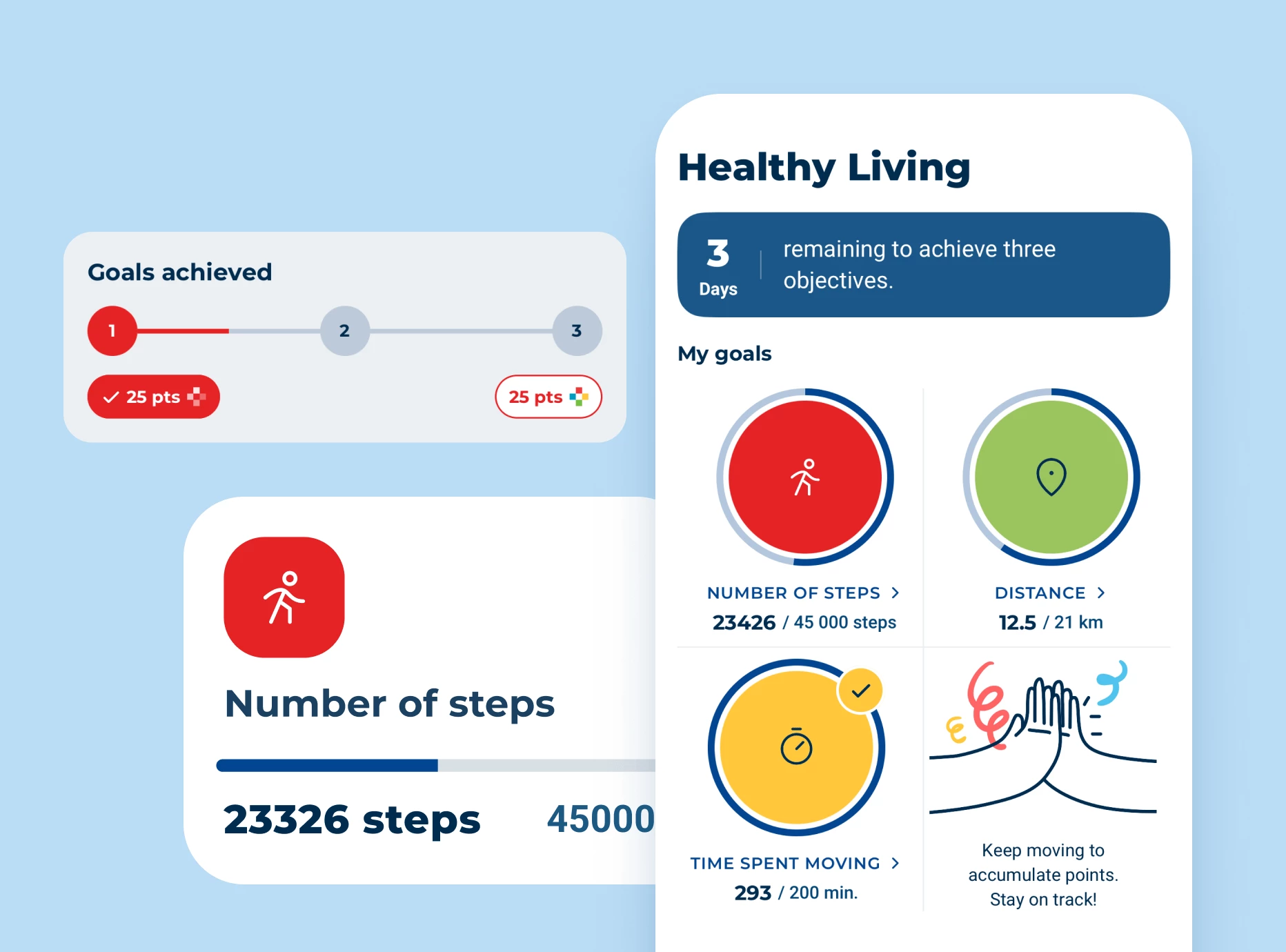
Healthy Living allows users to transform their commitment to an active lifestyle into tangible rewards. Integrated with Apple Health and Google Fit, this feature enables users to set weekly goals such as a number of steps, distance travelled, or active time. By achieving these goals, users can earn points each week.
Familiplus Scratch Card
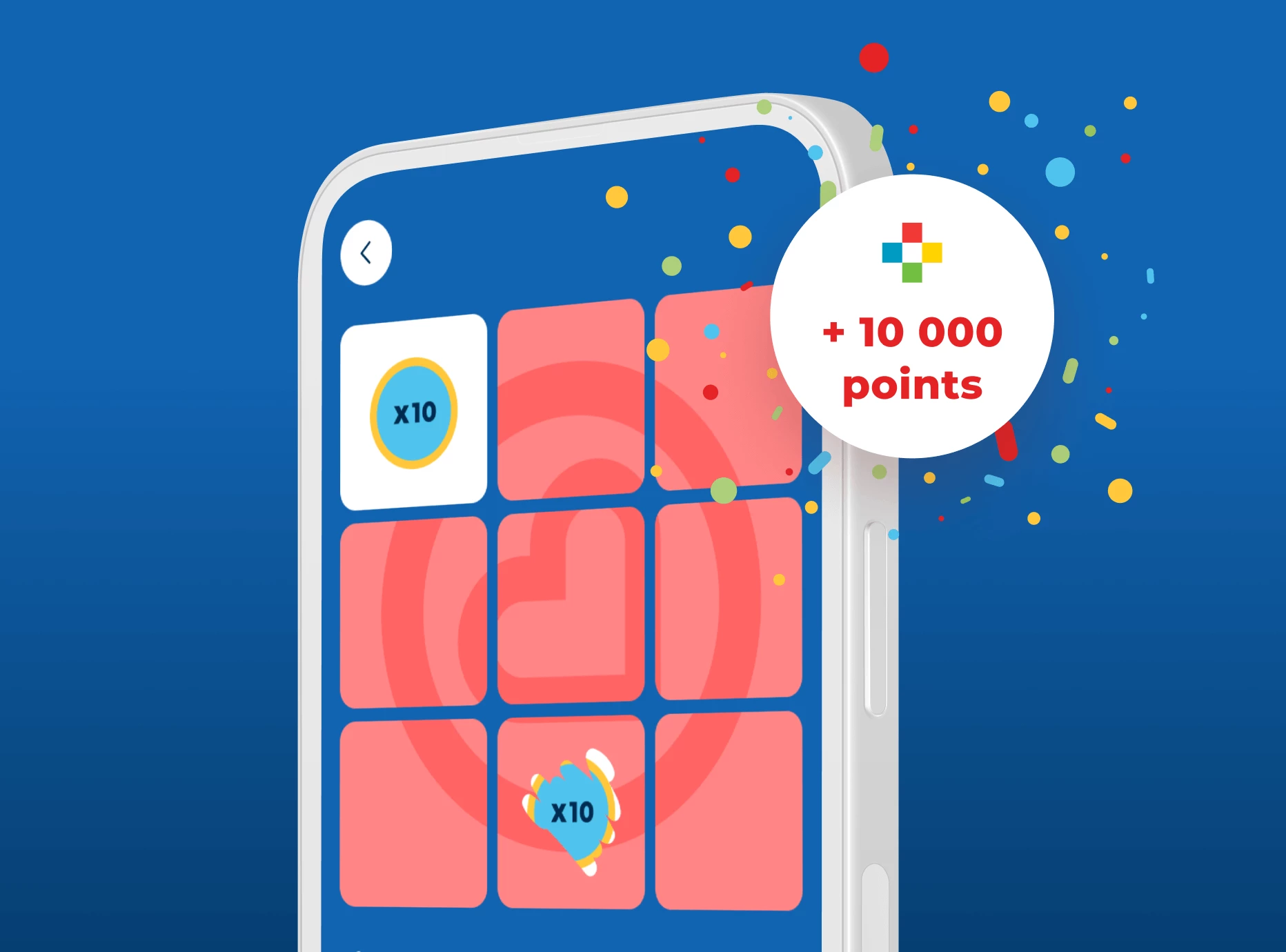
We've built a gamification mechanism into the app that invites users to return to the app on a weekly basis for a chance to win Familiplus points.
Technologies
Redesigned software architecture
To better meet the needs of the Familiprix team and their customers, we took an optimization-focused approach. Using React Native, we developed a new native mobile application that was completely redesigned to provide an improved, modern user experience.
To design a software architecture capable of handling data from multiple services and APIs, we developed a middleware service using .NET Core 8, a technology favored by the Familiprix team to facilitate project handover after initial development. This core middleware plays a key role in acting as a bridge between the various data sources in the digital ecosystem. It greatly facilitates the creation of multiplatform digital products that require communication with many different databases and APIs. By centralizing information, it standardizes the final data sent to the application interface, while simplifying maintenance and the evolution of future development phases and functionalities.

Human-centred vision of healthcare
Prescription Management for the Whole Family
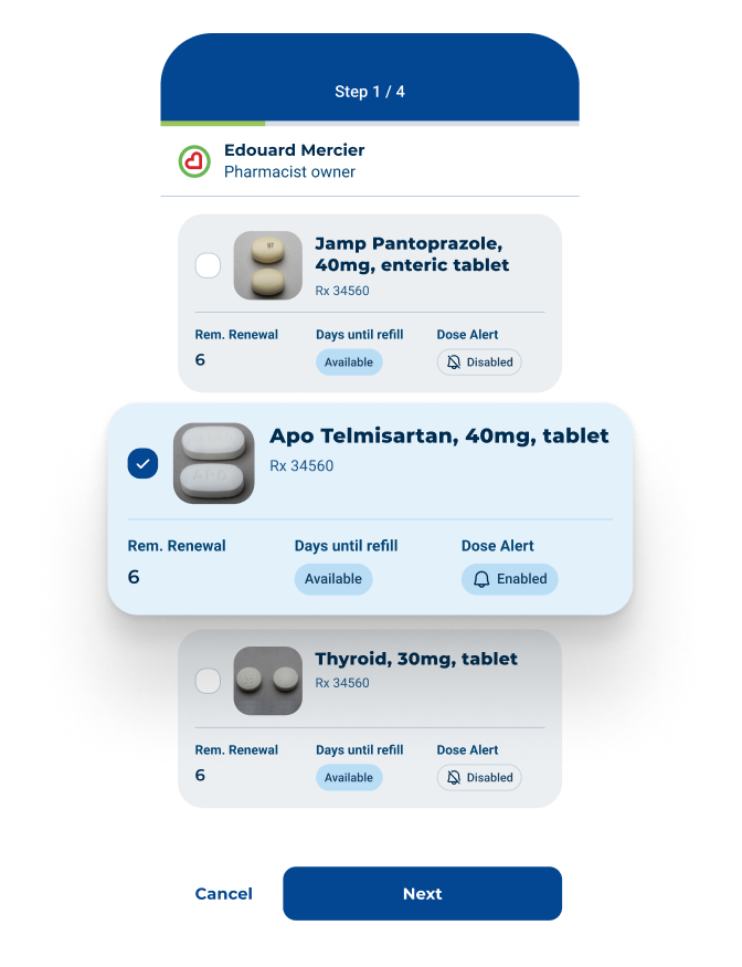
Users can access a detailed view of each prescription, including drug name, dosage, refill information, and history. They can also renew their prescriptions, add a new prescription to their file, and share their file with a loved one, an easy and secure way to help them manage their prescriptions.
Dosage Reminders
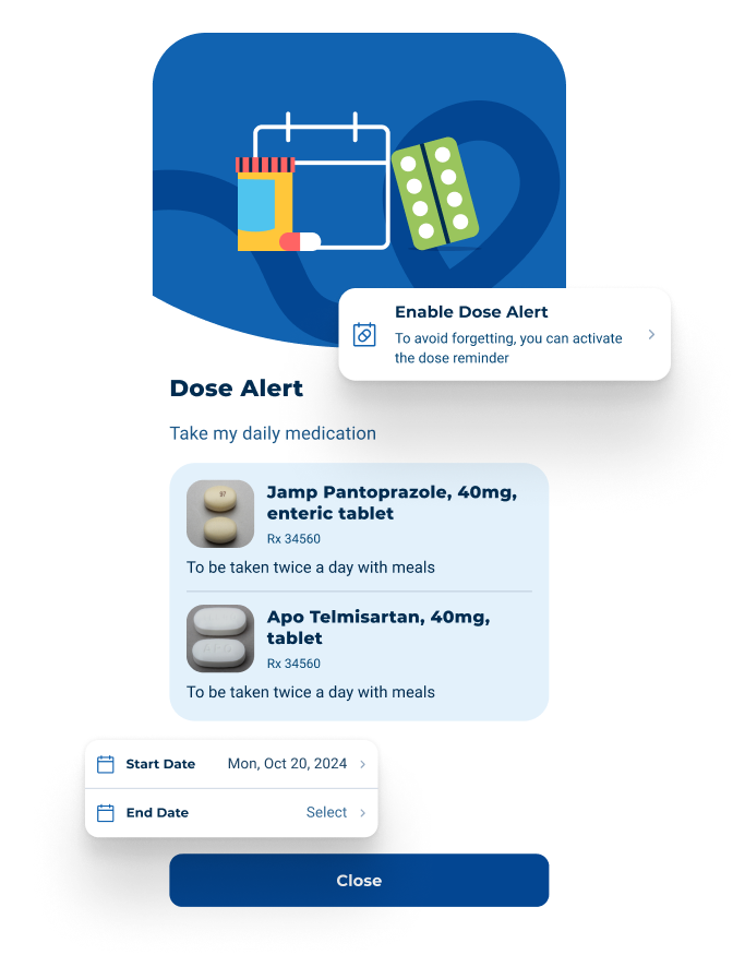
Through dose alerts, users can easily create personalized reminders for their medications to improve adherence and receive notifications when it's time to take them for optimal health monitoring.
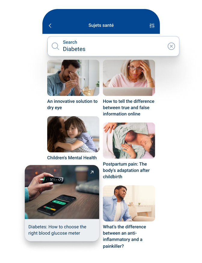
Medication Index and Practical Information
The drug search tool allows users to find detailed information about a specific medication. Users also have access to a variety of articles to learn more about various topics that affect their health.
Approach
Working together leads to success
The key to the success of a project is the effective collaboration between our team and our client's team. This was not the first collaboration between the Mirego and Familiprix teams, and this long-standing relationship of trust was a major asset to the success of this project.
Building on our strong partnership, we experimented with a different approach and set up an integrated project team consisting of members from both the Mirego and Familiprix teams. The main goal of this approach was to actively involve the internal Familiprix team at every stage of development to facilitate knowledge transfer.
Results
The app has shown remarkable results since its launch in June 2024.
70K
monthly active users
+7K
new monthly users
+15K
new subscriptions to the Familiplus program using the app


